AlbertaPeptides
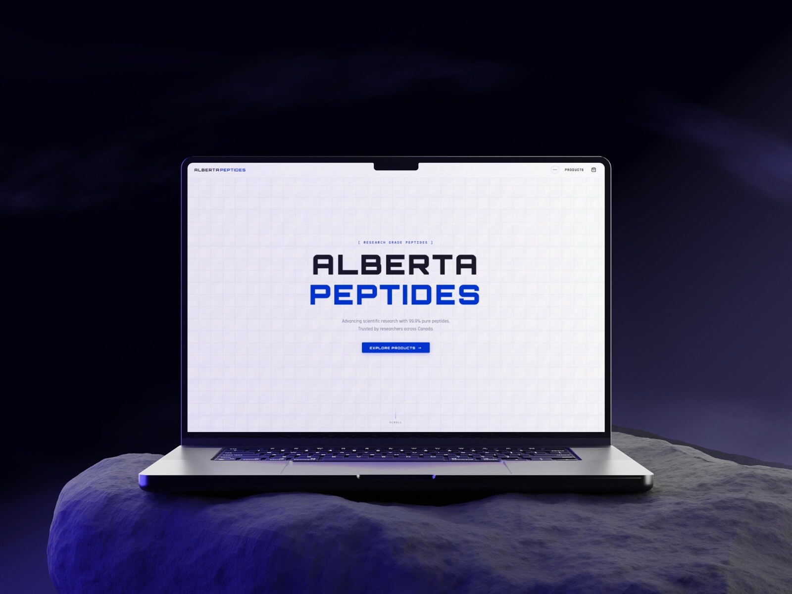
Wellness, engineered like equipment. Alberta Peptides needed an interface that felt as exacting as the science inside their bottles — industrial, high-tech, and unambiguously serious.
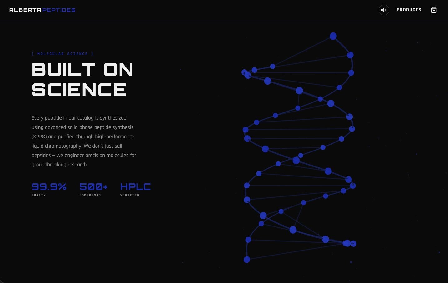
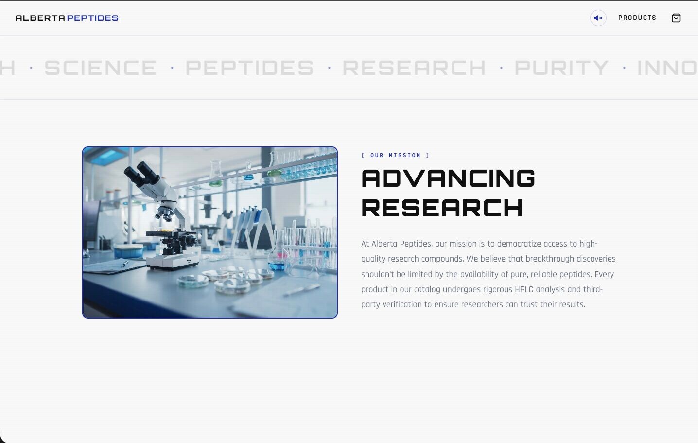
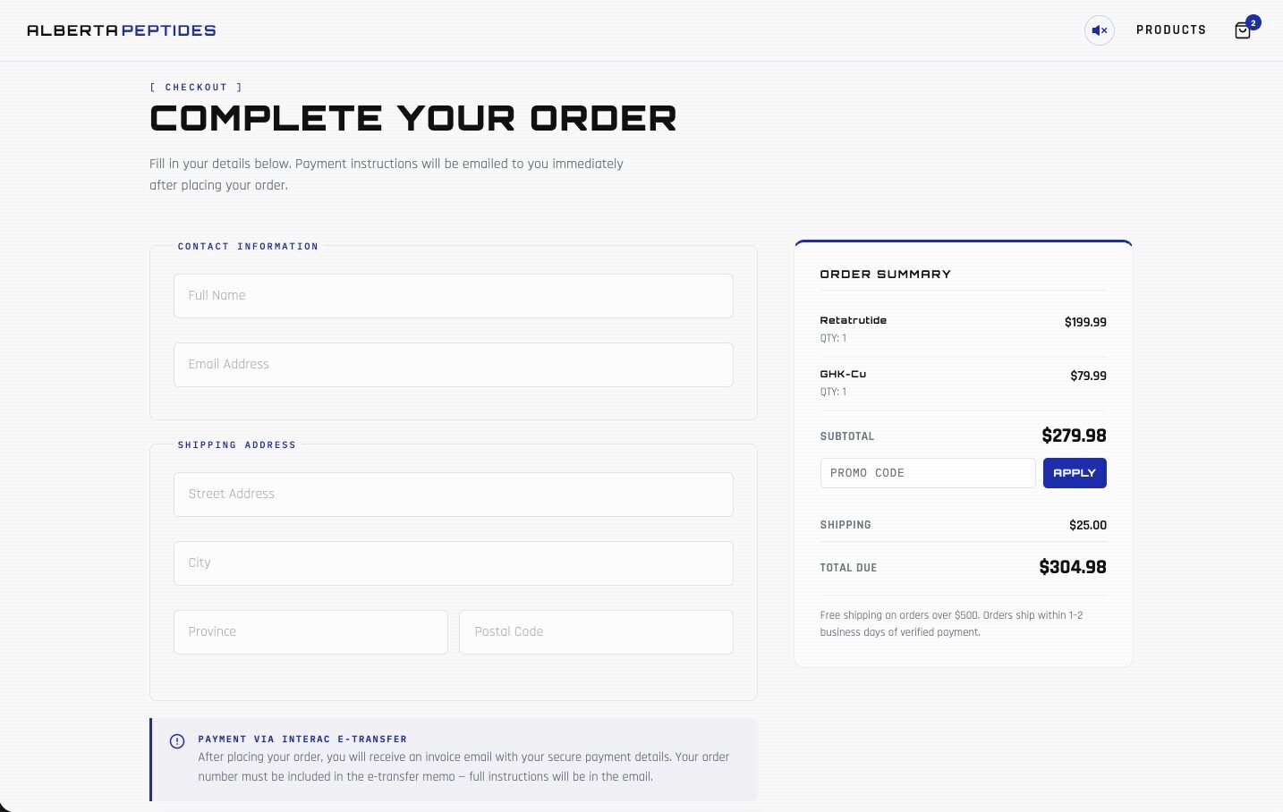
We leaned hard into the lab: brushed surfaces, technical typography, schematic detail, and a UI that reads more like an instrument panel than a marketing site. Research, dosage notes, and product specs all share one rigorous, mechanical rhythm.
Services
- Brand Identity
- Web Design
- Web Development
- Sound Design
- 3D Elements
- Copy
Next Project